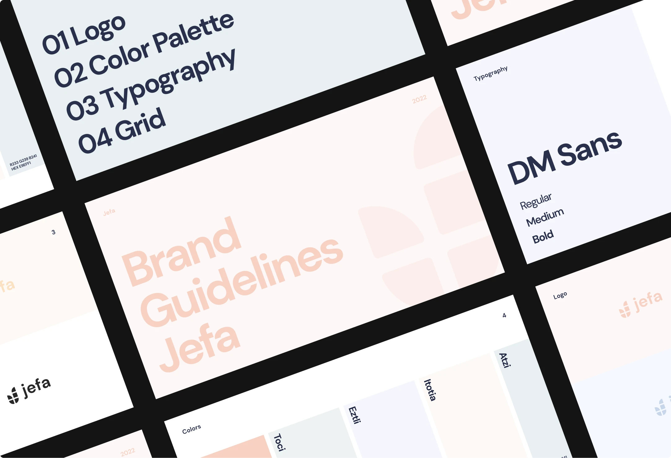
Branding
Design
Development
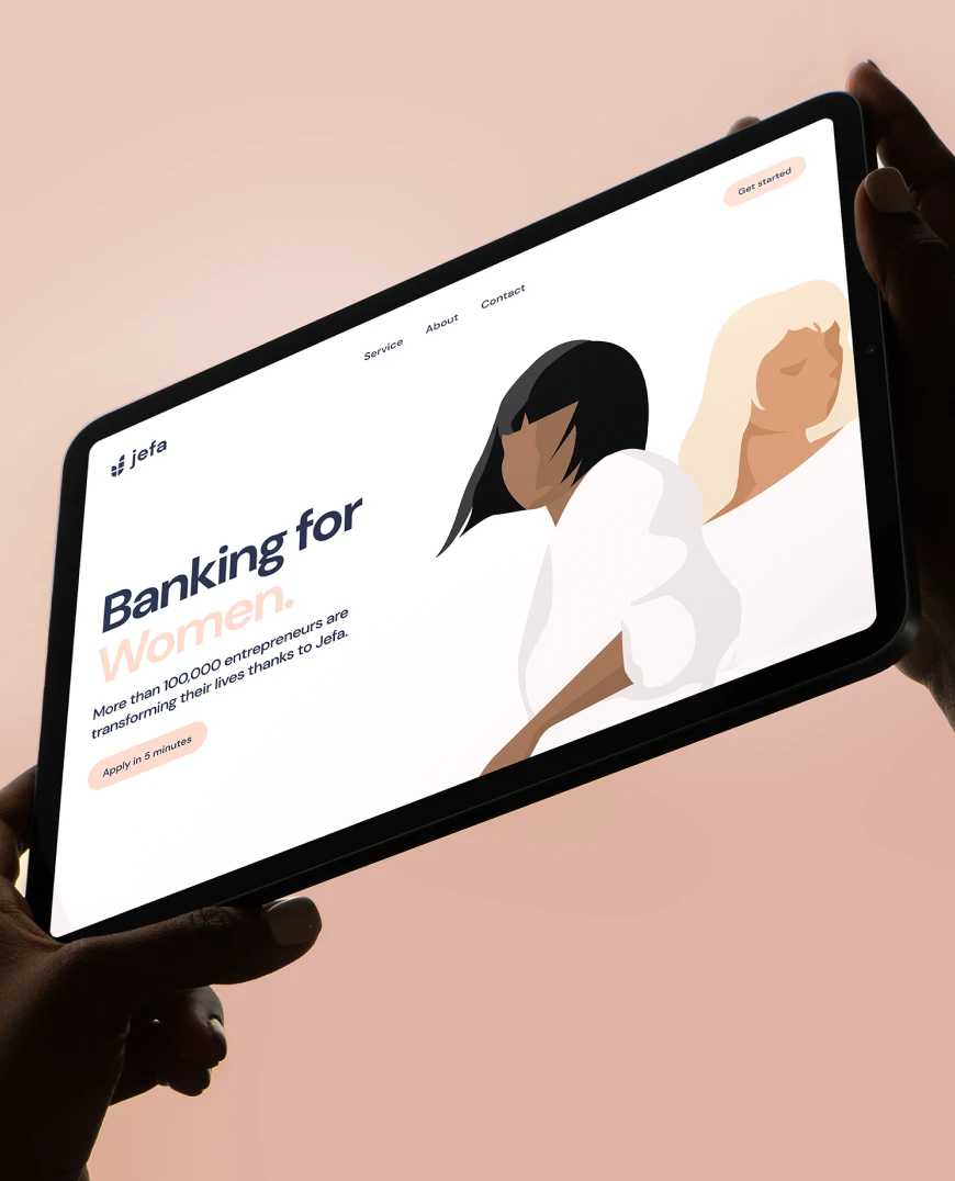
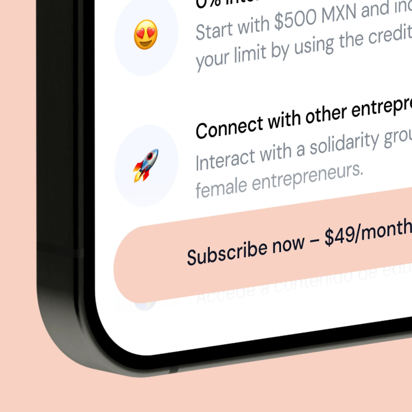
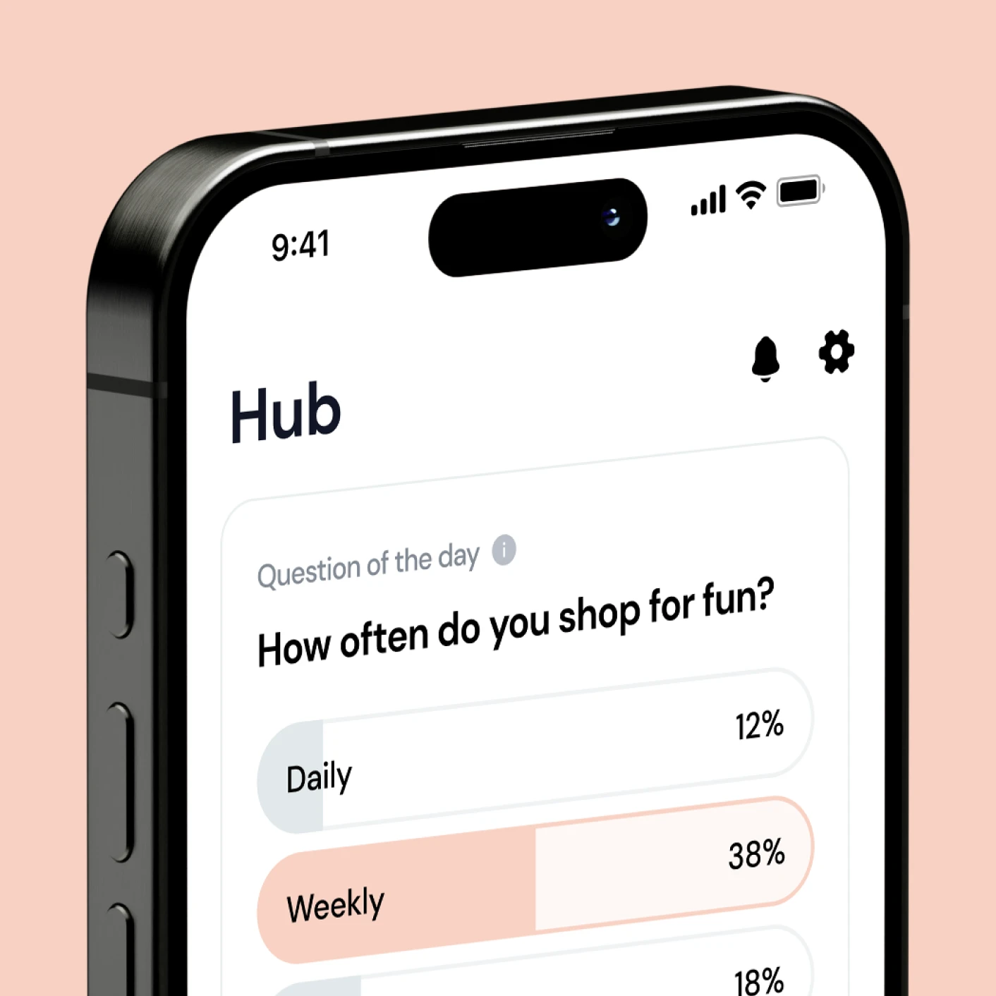
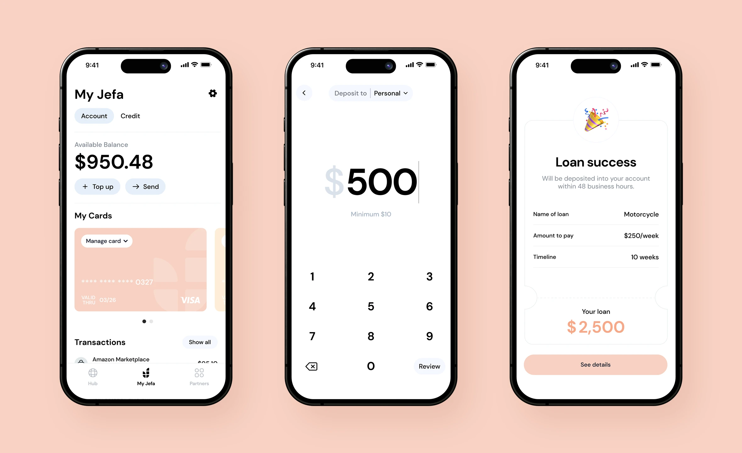
Jefa
“Won Agency understood our vision from day one. They delivered a product that our users love and that we're proud to put our name on.”

“Won Agency understood our vision from day one. They delivered a product that our users love and that we're proud to put our name on.”
Next Project
ApprovalBase